TELL ME ABOUT IT
The brief’s objective was to illustrate a Children’s Book provided by a professional writing student. I chose a book of poetry called Wintertide. While reading the poetry, I recognized a variety of recurring themes and images that I felt could be formed into a linear narrative with a backstory. I took some creative licence to rearrange the author’s original poem sequence to fit the narrative that I had in mind. My book was shortlisted for production by Algonquin College
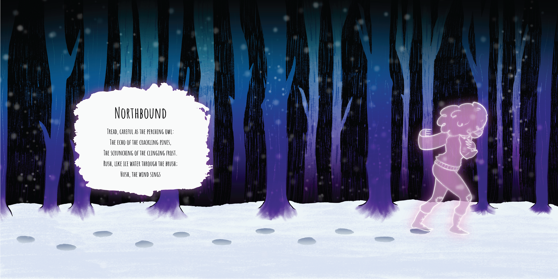
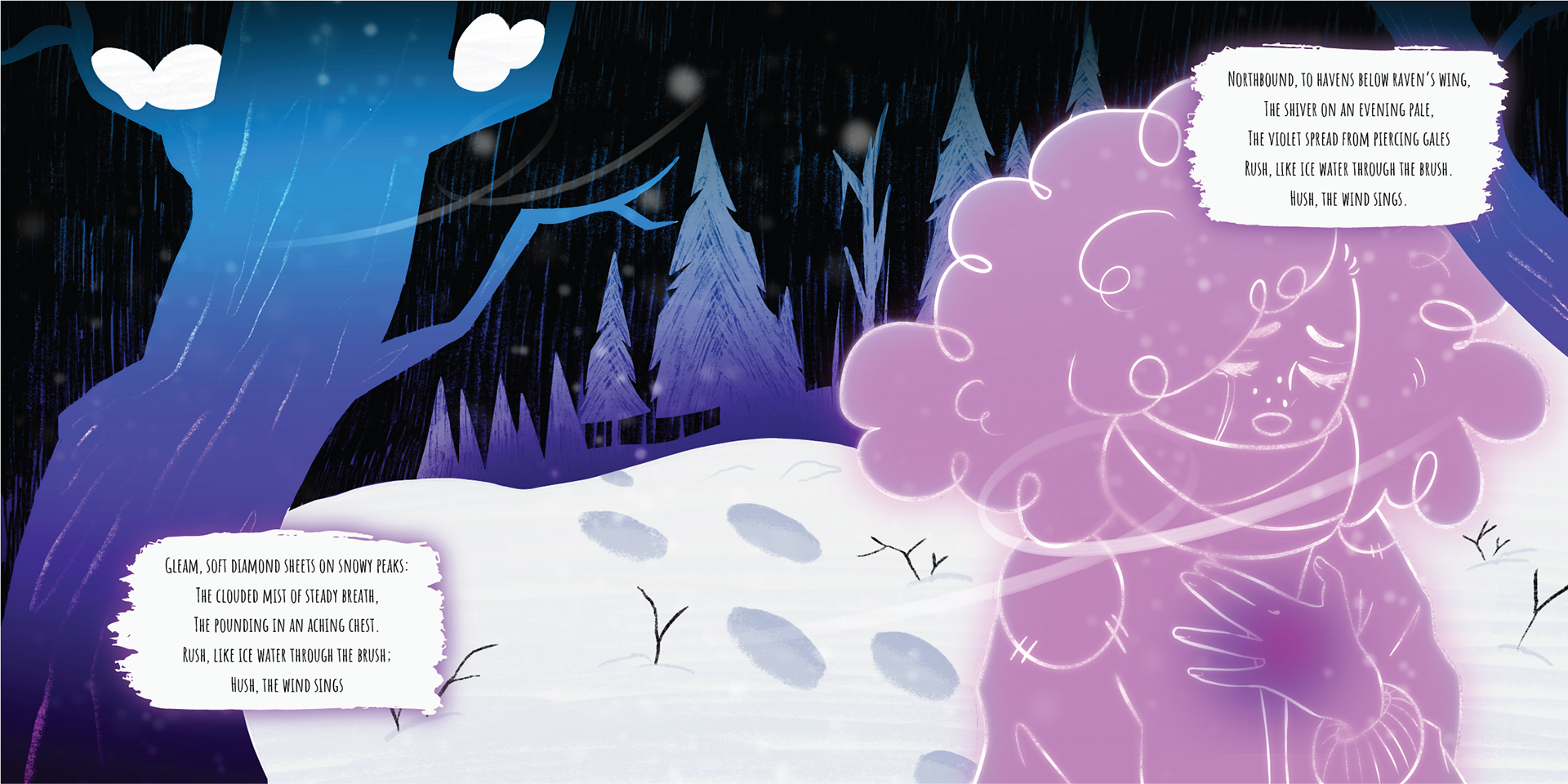
While reading the poetry, I recognized a variety of recurring themes and images that I felt could be formed into a linear narrative with a backstory. I took some creative licence to rearrange the author’s original poem sequence to fit the narrative that I had in mind. I felt that the poem “Northbound” represented the beginning of a young girl’s symbolic journey to find herself. I decided that the repetitive verse, “Hush, the wind sings” could work as a reference to specific memories found in the next three poems: Siren Song, Mariana, and Watching Castles, as the verse is repeated three times.
With this as a starting point, the rest of the story eventually fell into place for me. I identified the primary themes as loss and longing, anger and retribution, and recognition and acceptance. These themes represent the stages of the young girl’s life experiences culminating in a realization that she must find a way to love herself and become her own person.
TOOLS
Photoshop / Procreate / InDesign
WINTERTIDE - FINAL SPREADS
Back/Cover
1/2
3/4
5/6
7/8
9/10
11/12
13/14
15/16
17/18
19/20
THUMBNAILS
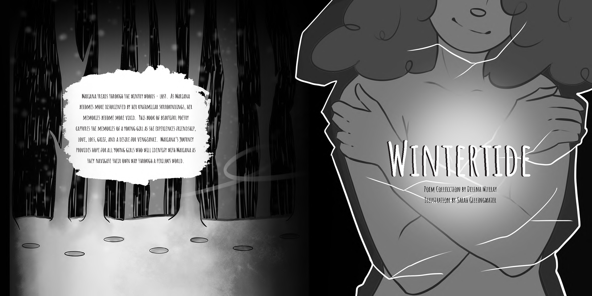
BACK/FRONT COVER
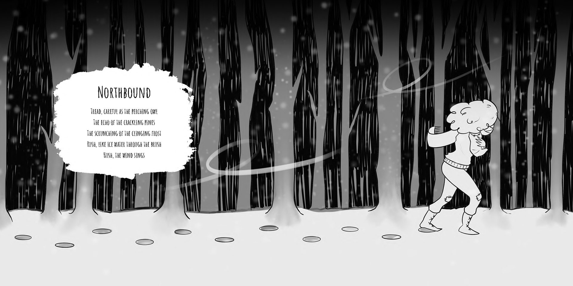
1/2
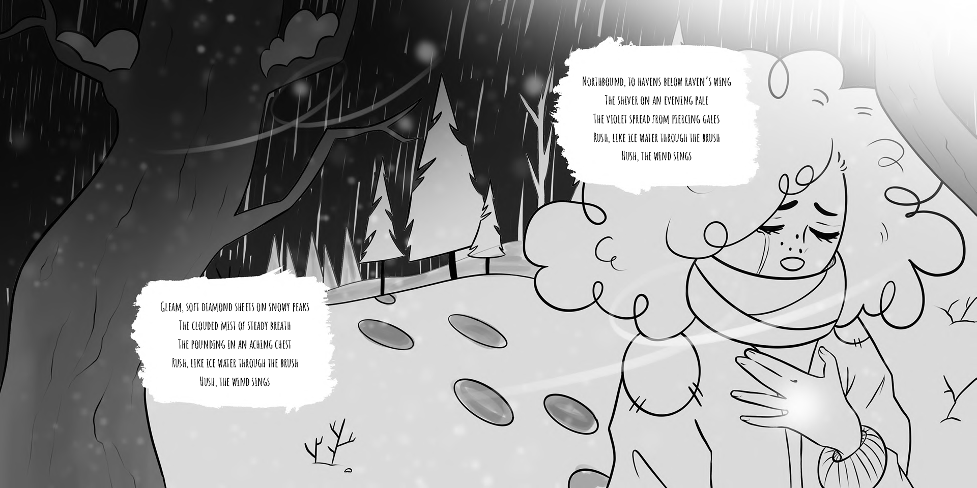
3/4
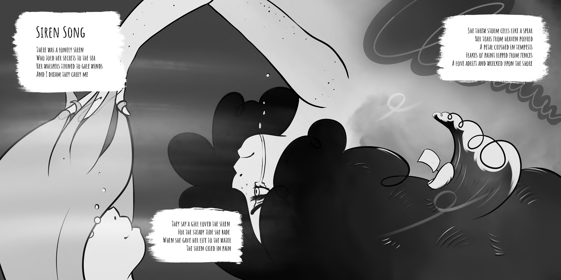
5/6
7/8
9/10
11/12
13/14
15/16
17/18
19/20
rationale
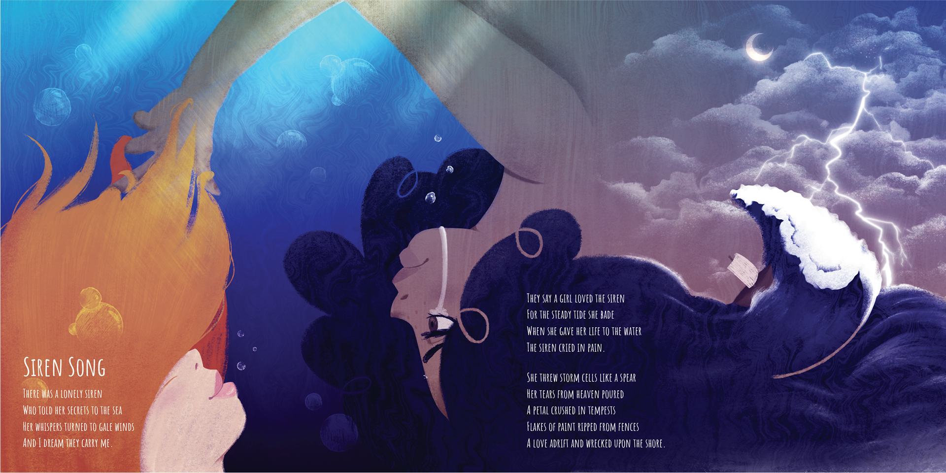
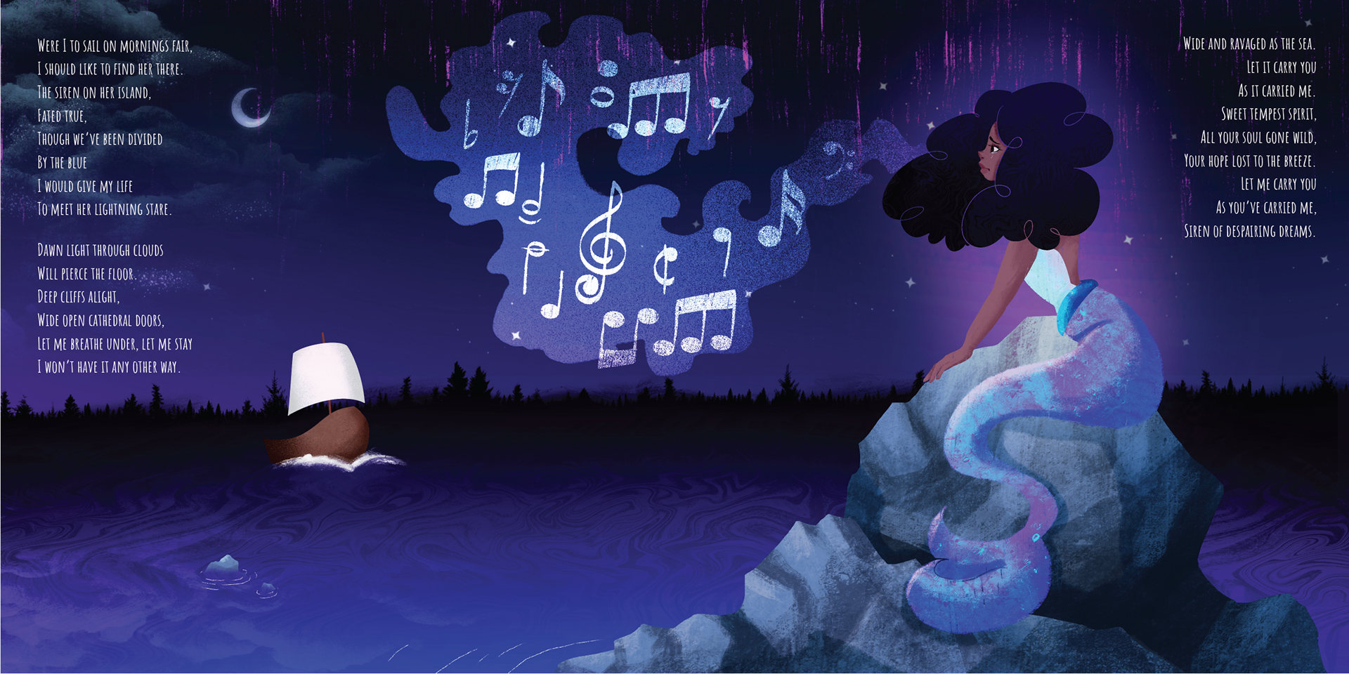
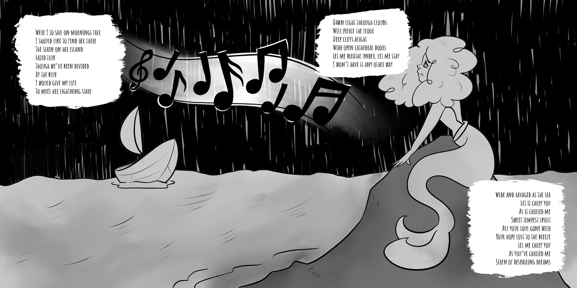
I wanted Siren Song to be a love story between two young women. To me, it’s a story of first love torn apart by the circumstances of life. A young girl leaving her lover to broaden her horizons and the sorrow and lifetime longing that comes with that. I’ve represented the poem with an image of the two young women laying together, obviously in love, and the subsequent departure of one of the young women as she sails away leaving the other behind. The inclusion of the musical notes represents the allure and longing felt by both women after the departure.
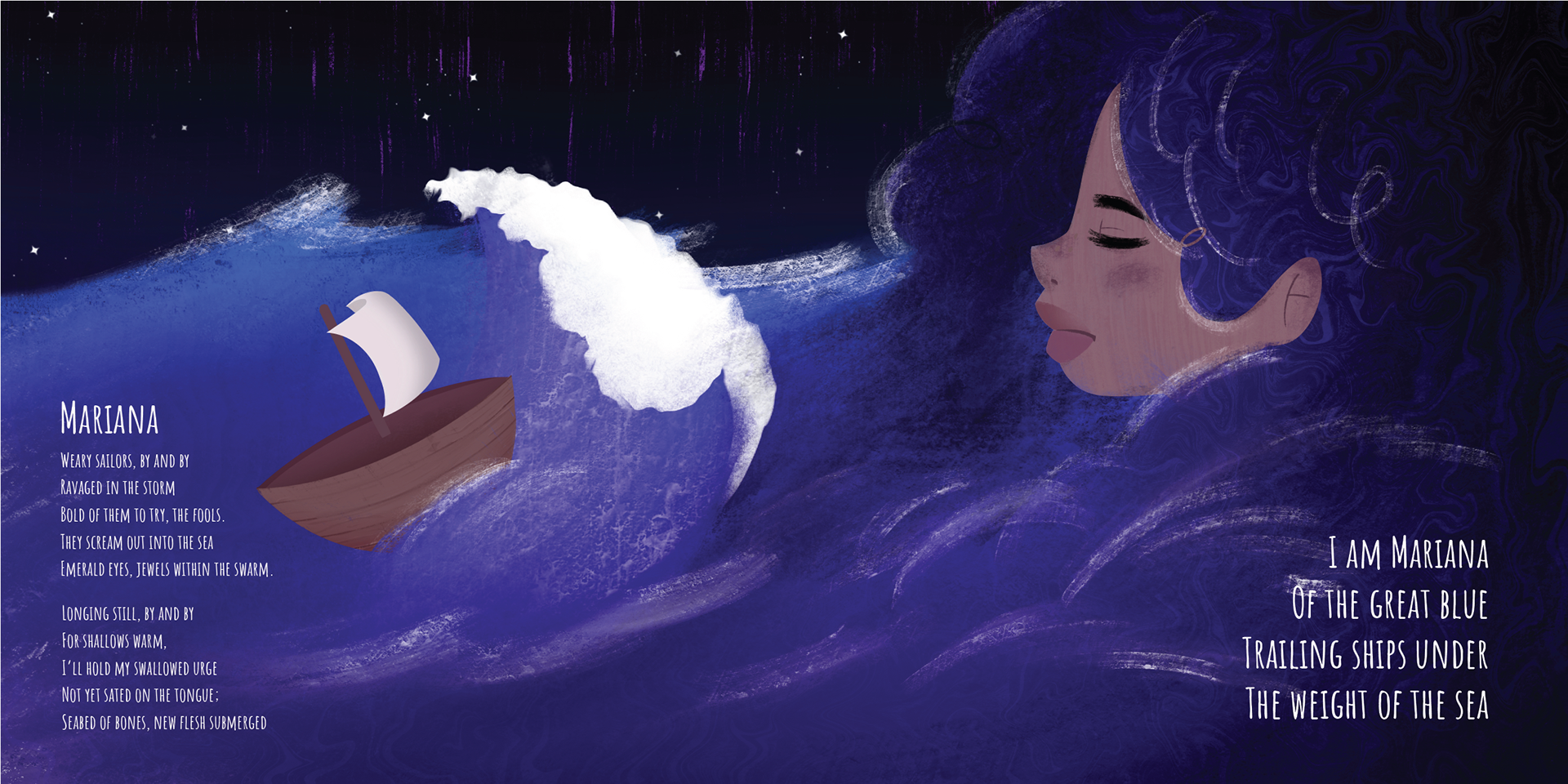
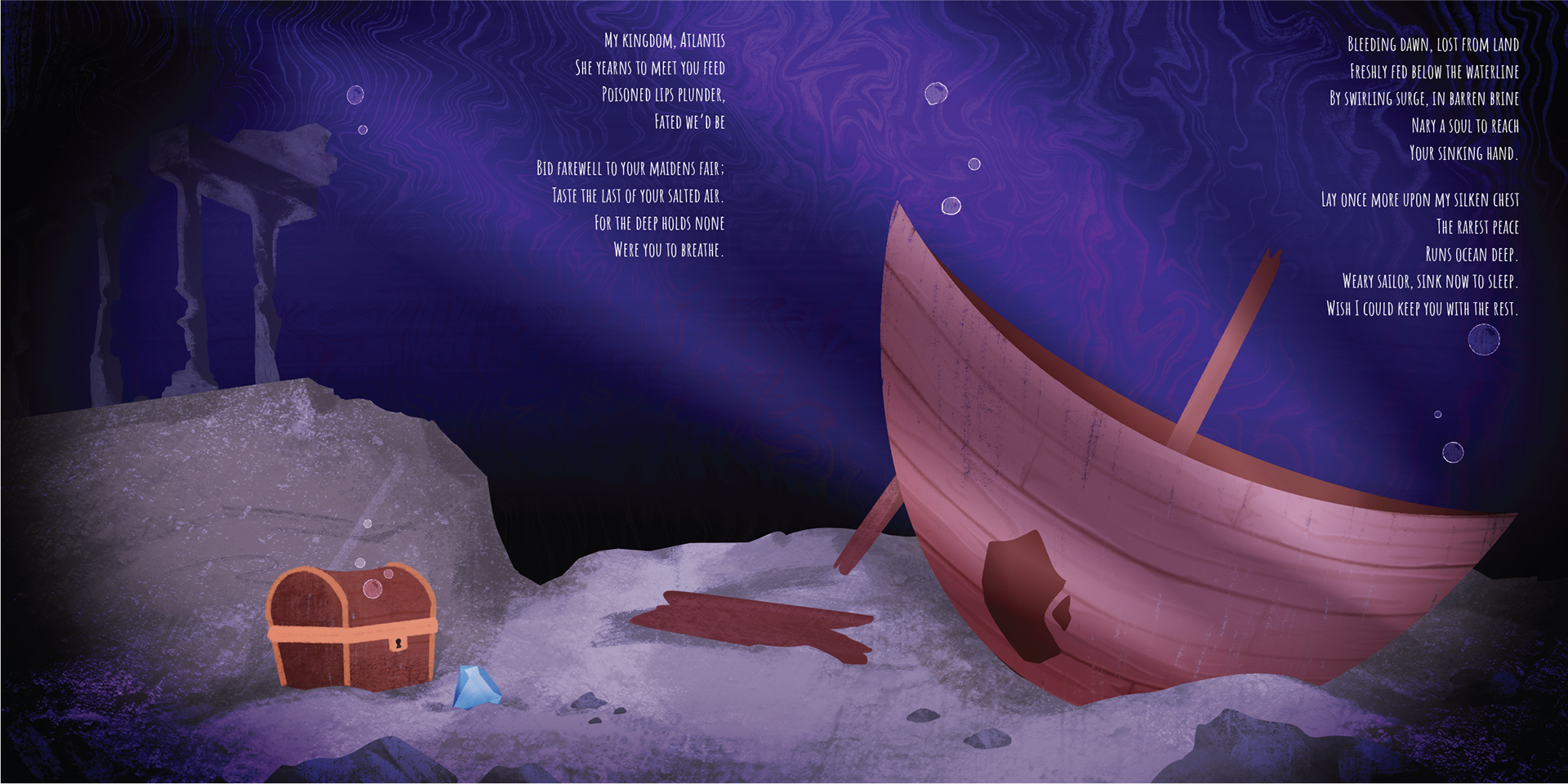
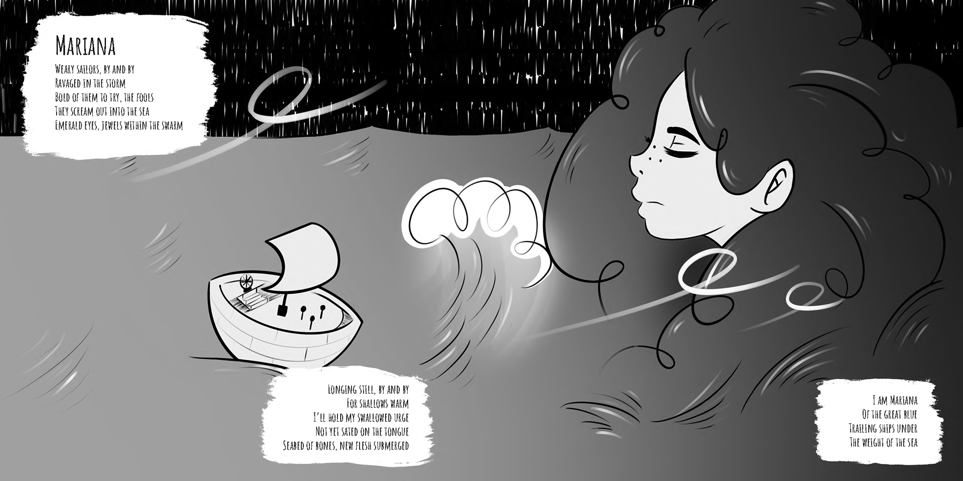
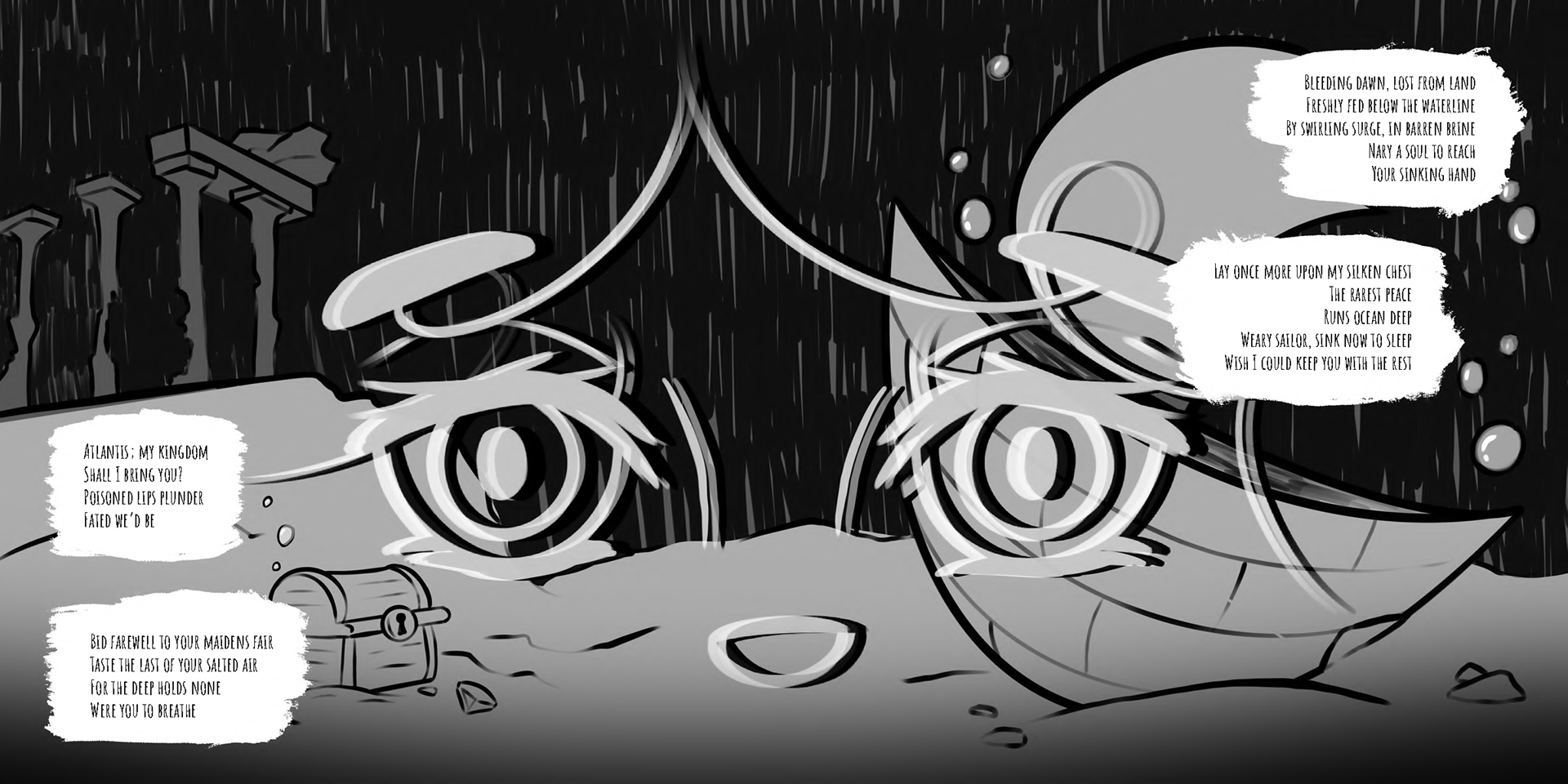
Mariana, the poem’s title that made me decide that Mariana would be my heroine’s name, is a story of life’s disappointments. It’s all of life’s promises broken by bad people and bad circumstances and the desire to seek retribution from it. I’ve illustrated Mariana as a larger-than-life image/force. In the first spread, she is seen luring sailors to their death as retribution for her perceived disappointments. In the second spread, her image is seen as a face peering through the water to the deadly depths below.
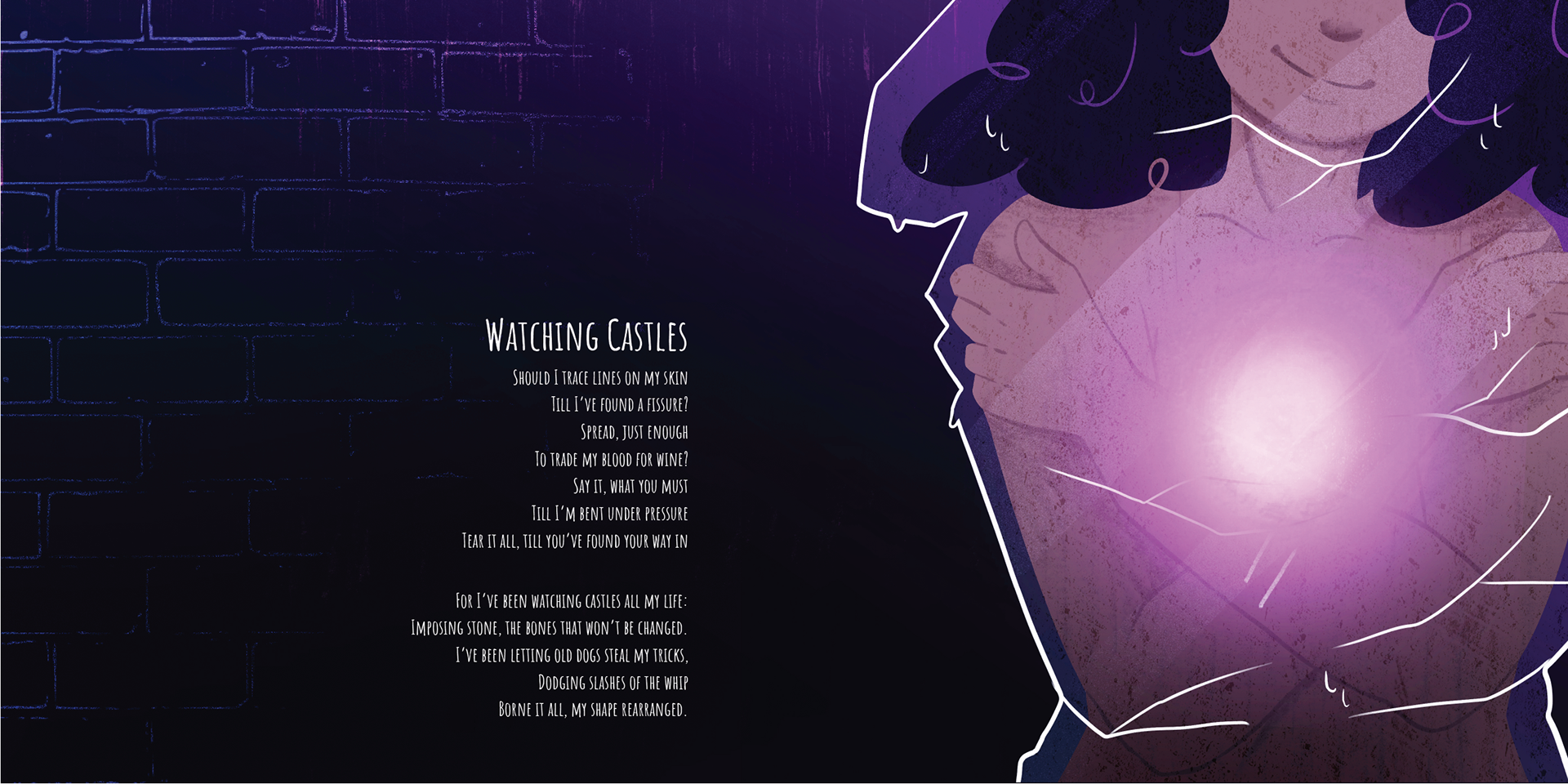
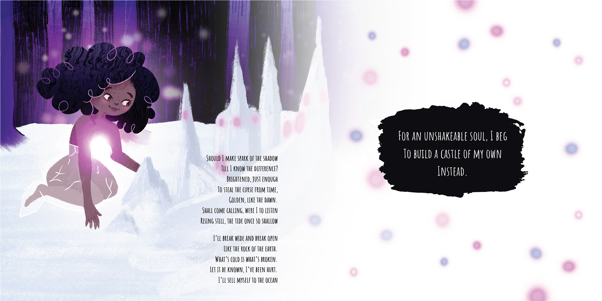
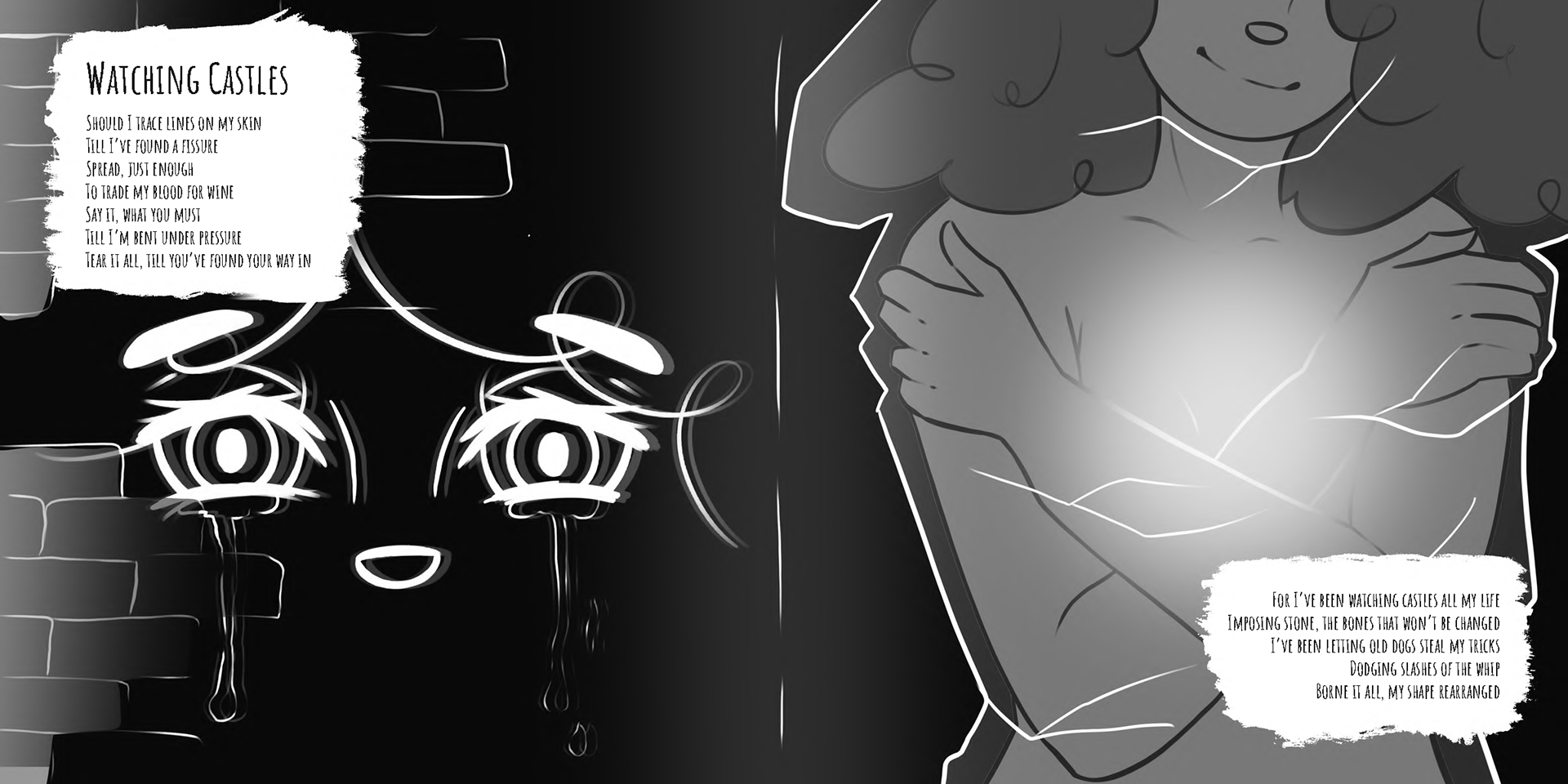
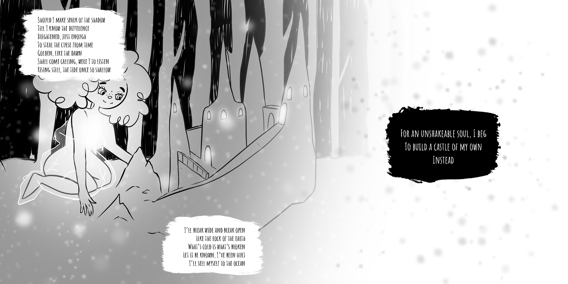
Watching Castles was the most challenging design for me. My view is that this poem represents Mariana’s most important life experience, as it is the catalyst for change. I decided to repeat the image of Mariana’s face dripping with water, looking like tears, as a segue from the previous spread. The intention being that she has finally realized that retribution is not the answer to life’s disappointments. She analyses how she has been trapped by life’s expectations of her and how she has let others determine her path - how she has “borne it all, my shape rearranged”. I’ve depicted Mariana as a girl frozen, covered in ice - unable to move. This is a metaphorical image for Mariana’s entrapment. The second spread shows Mariana’s eventual freedom from her restrictions as she is shown building her own castle.
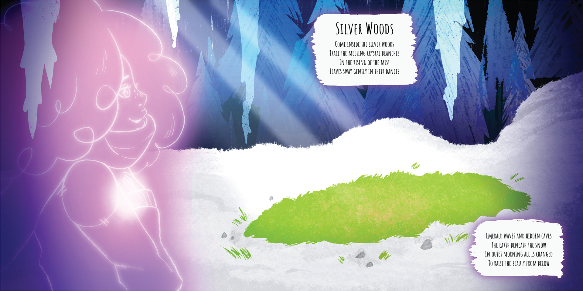
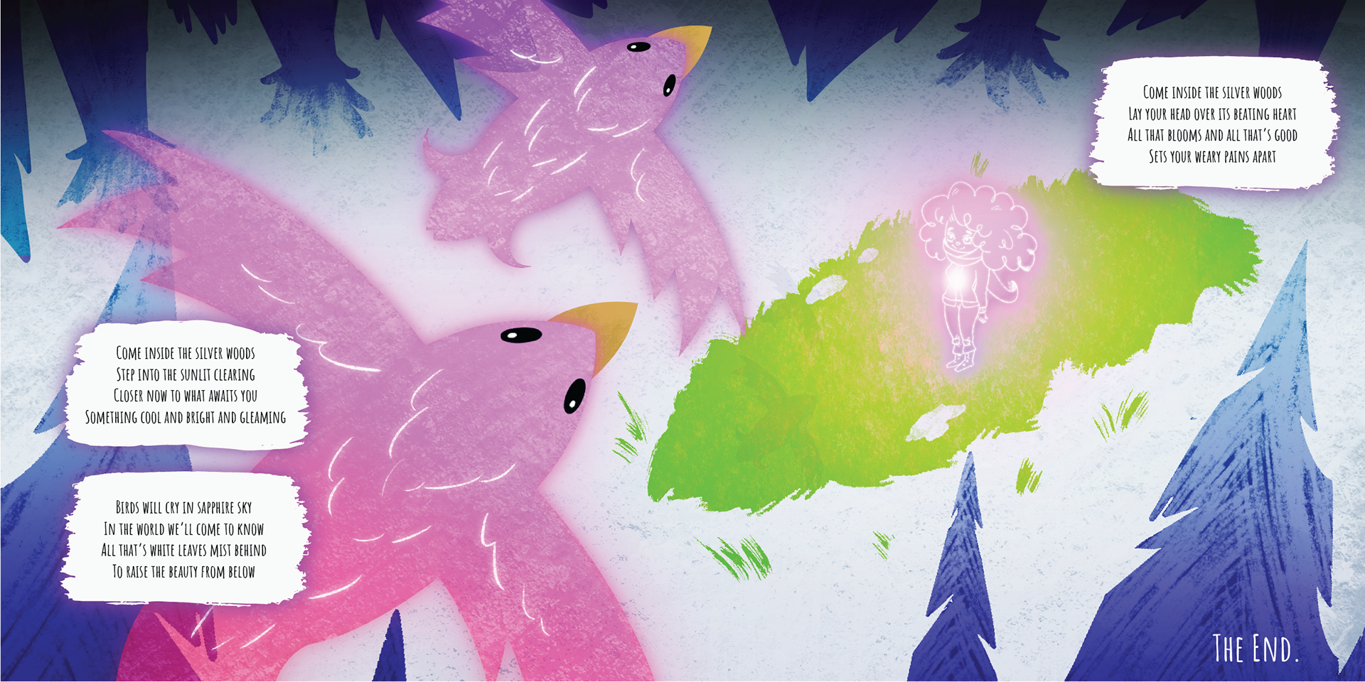
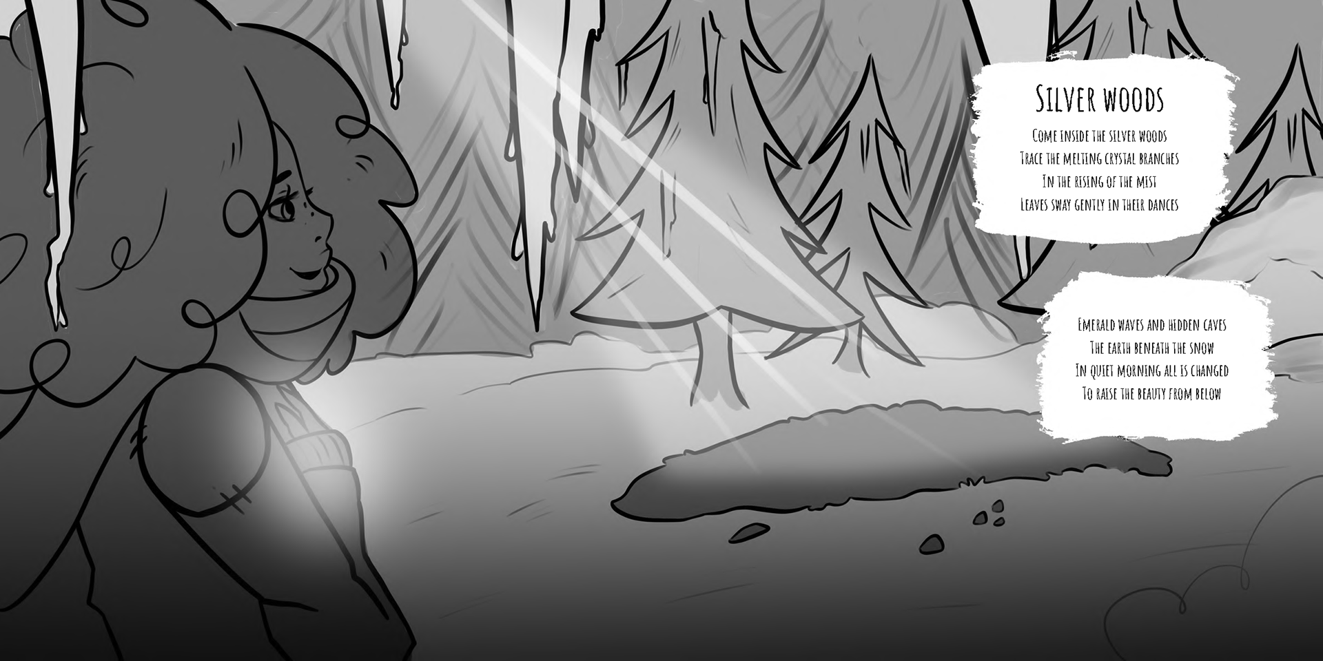
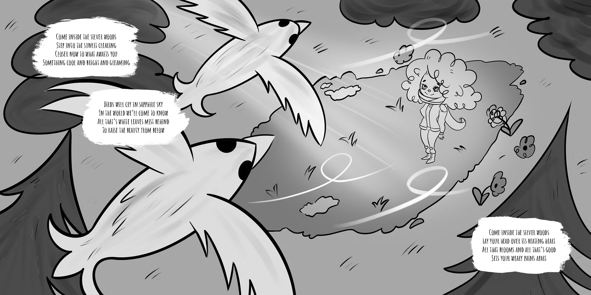
Silver Woods is my favourite poem in the series. It is full of hope for the future and it represents the pinnacle of Mariana’s journey. In the first spread, she can see light shining in the clearing ahead. In the second spread, she looks towards the skies and sees the freedom of the birds flying above her. The flowers beneath show the eventual growth that will come. She has arrived at a better place than where she started.
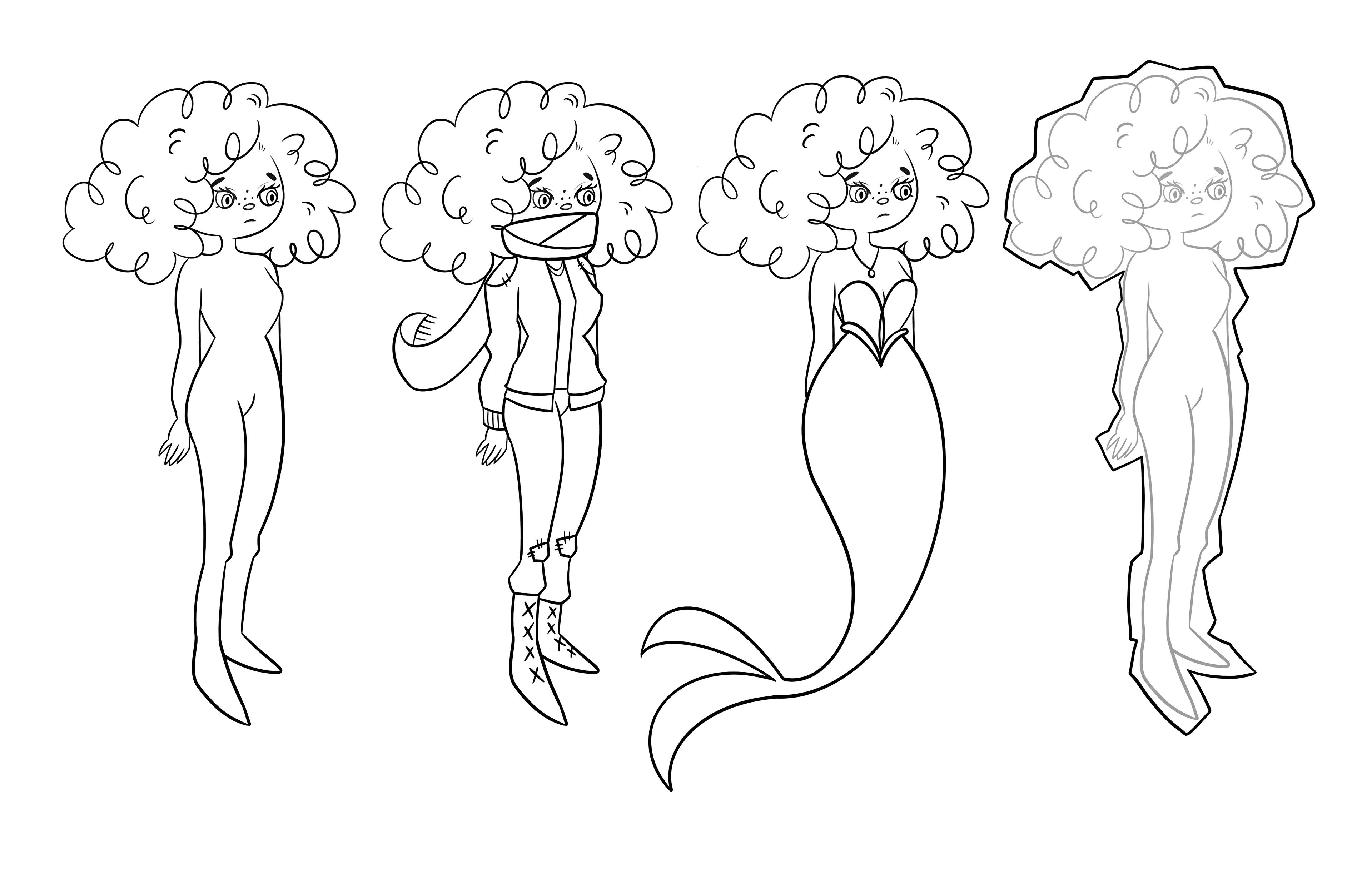
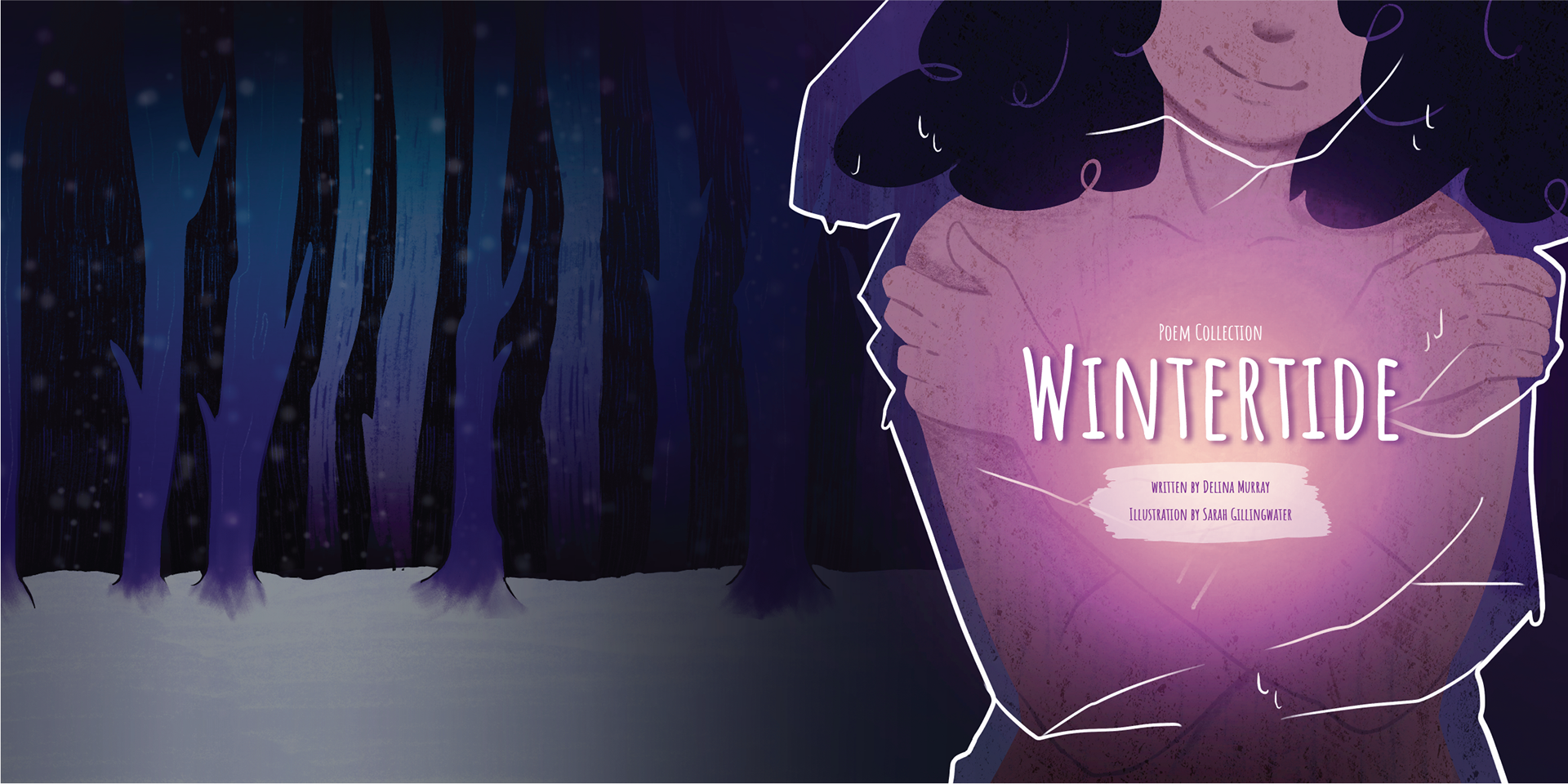
It is my thought that this series of poems can best be targeted to young adults in search of an understanding of their own life experiences. As such, I was inspired to use a graphic novel style for the artwork - a style that appeals to many young adults. The palette choice is done (and will be done) in cool tones as inspired by the overall “Winter” theme of the poetry series. I favoured blue and purple tones. I did use a warm, yellow colour in my character’s chest area to depict her ability to finally love and accept herself. The last spread will have a burst of rainbow colours to represent the pinnacle of Mariana’s journey - her arrival.